Cutting a sign-up down to a phone number.
This was a restaurant waitlist app losing about a third of its sign-ups during onboarding, with a 2.5 app store rating to match. I led the redesign and ran the research, then rebuilt the flow around the moment people actually used it: on their phone, already in line, on bad reception. The account went from eight screens to a phone number and a code. Sign-ups rose from 65 to 95 percent, the rating climbed to 4.1, and a first-time user's step count roughly halved. It shipped in 2016, so the screens look their age. The thinking and the numbers are what hold up.
The problem
A full sign-up, at the moment people had the least patience for it.
The app let you join a restaurant's waitlist from your phone, so in theory you'd never stand around waiting for a table again. The value only lands the next time you go out, when you can get in line before you even leave home. The trouble was where people first ran into it. A few found it in the app store, but most met it the hard way, already stuck in line at a restaurant and downloading it right then. That is the one moment the app cannot actually save them any time. So the whole job of that first sign-up was to be easy enough that they'd come back and use it the way it was meant to be used.
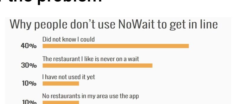
Instead, only 65 percent of people finished signing up. Most were doing it inside the restaurant on bad cell reception, with a couple of minutes of attention, and the flow was asking for a full account. A survey showed the rest either did not understand what the app was for or gave up partway through.
What I inherited
Every screen made sense on its own. Together they were too much to get through.
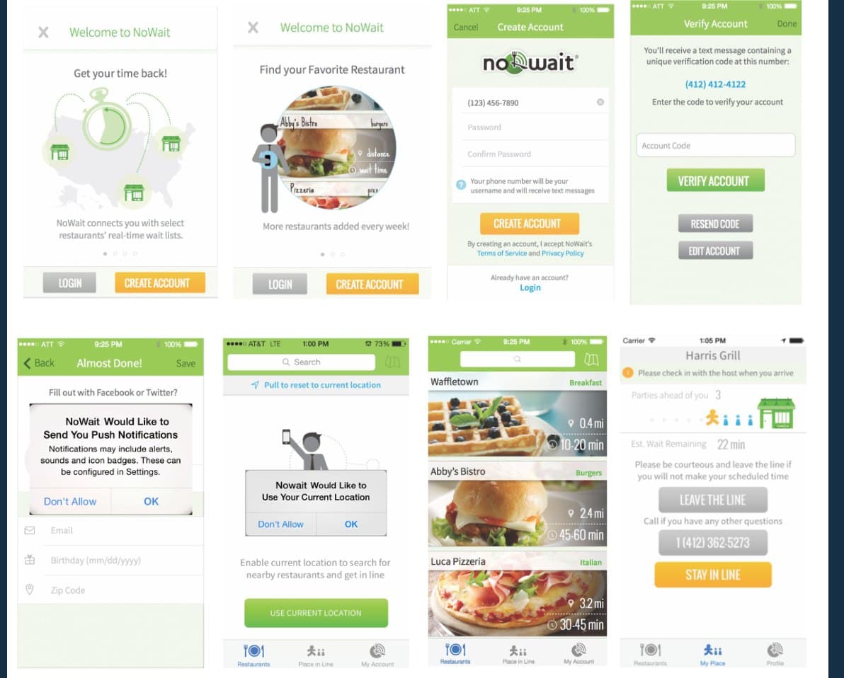
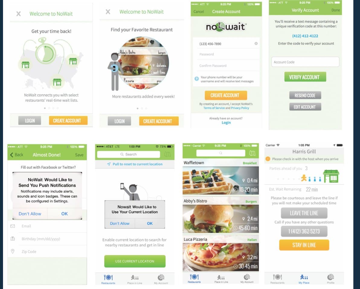
When I picked it up, the flow was built like a product tour. Four welcome screens most people skipped. Then an account form asking for a password, a confirmed password, an email, a birthday, and a zip code. Then two system permission prompts, back to back. And after all of that, people still had a hard time finding their place in line, which was the only thing they had come for.
Research
I watched people use it in the place it was breaking, a real restaurant.
I ran moderated sessions on usertesting.com with the scenario set at a restaurant during a wait, and I reviewed real session recordings in AppSee to see where people stalled. I also went onsite, stood with the hostesses, and watched actual customers try to use the app while they waited. Alongside that I went through how a dozen other apps handled phone sign-up and code verification, so I was not reinventing patterns people already knew.
Two things reframed the project. People were not planning ahead for next time. They wanted to download it, get in line, and put their phone away. And the bad reception was not an edge case, it was the normal condition.
“It took almost my entire wait time to download the app because of the cruddy cell service in the restaurant.”
Every screen I could cut was one less thing to load on a bad connection.
The decision
A verified phone number was the whole account.
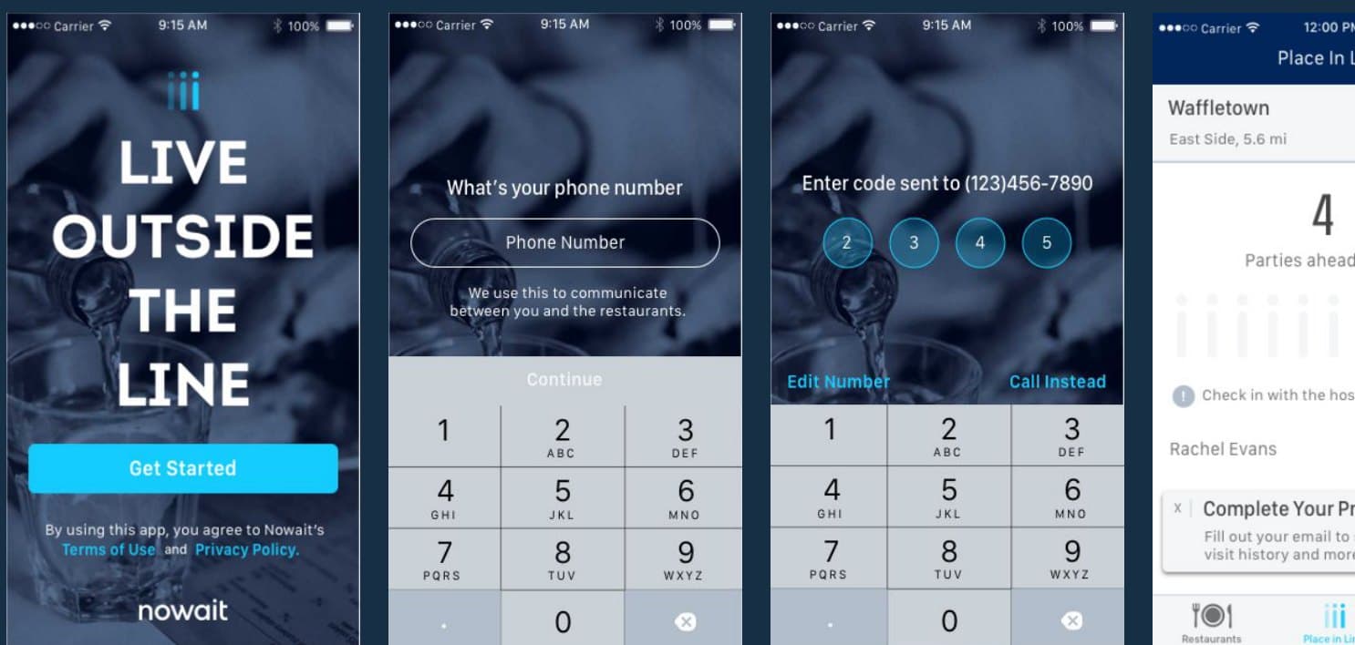
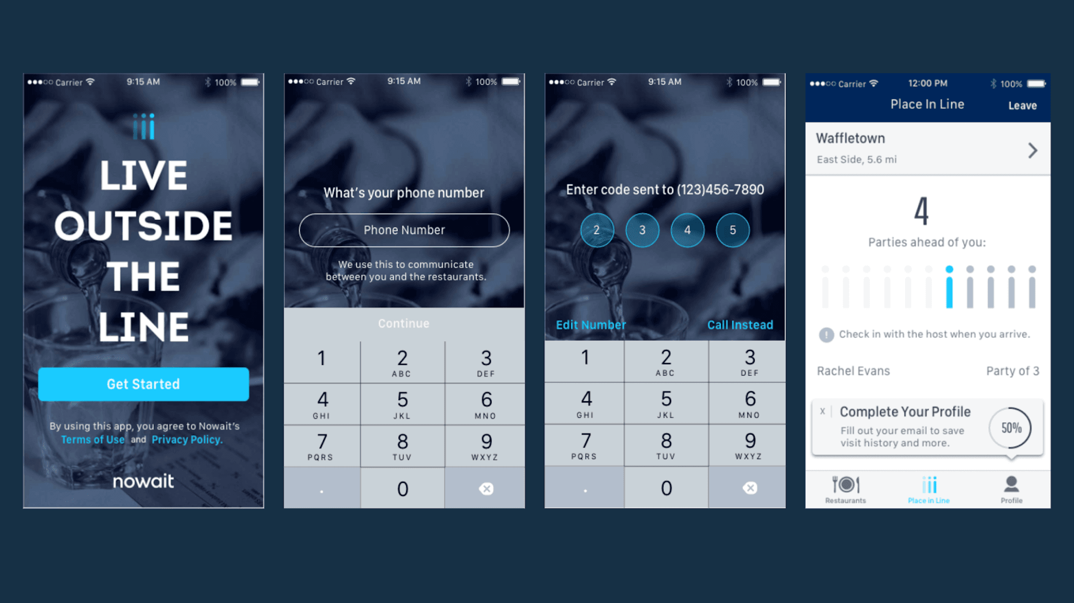
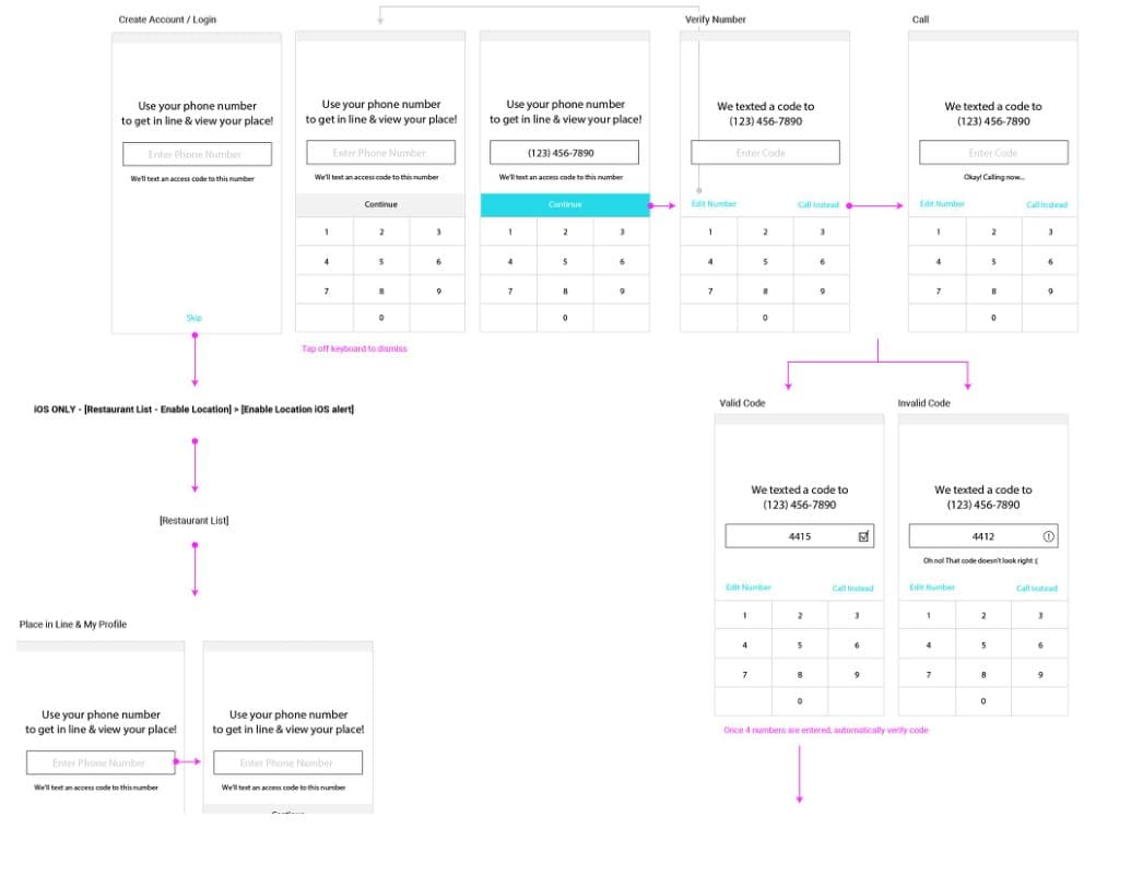
The core question was what an account actually needed to be. A verified phone number was enough to get someone in line and text them their place. Everything else was optional, and optional at that moment meant nobody would do it. So I cut the account down to two screens: enter a phone number, then enter the code we text back. The welcome tour became a single landing screen with one button.
The other decision was when to ask for more. We only prompt for profile details if the person is not already in line. If you are standing in the restaurant, you get the fast path and nothing else. If you are browsing from home with time to spare, that is when a profile prompt makes sense. Same product, two situations, and we stopped taxing the person who had the least to give.
I wireframed the whole flow, including the parts that break: a wrong code, a code that never arrives, a returning user on a new device. Trimming the flow only works if those edge cases are still handled.
Test and learn
The new flow tested better, but it was not finished.
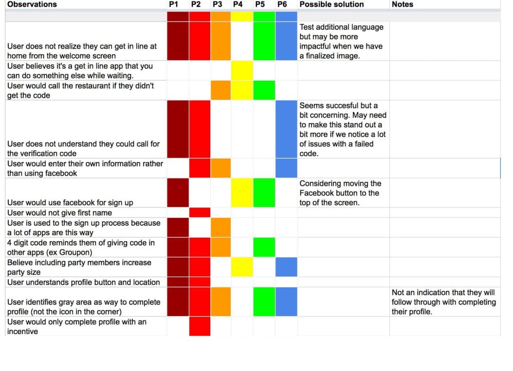
I tested the new flow against the old one, and ran first-click tests to check whether each screen read correctly at a glance. The new flow came out clearly ahead. But it was not a clean pass. A few real gaps showed up: some people did not realize they could get in line before leaving home, and the option to get the code by phone call was easy to miss when a text did not arrive.
I treated the observation matrix as a to-do list and tightened the copy and hierarchy in the spots where people actually got stuck, rather than where I had assumed they would.
Results
The numbers moved, and the one that mattered most was completed sign-ups.
Completed sign-ups went from 65 to 95 percent, measured in the conditions people actually used the app in. The app store rating rose from 2.5 to 4.1. Push opt-in more than doubled, from 30 to 70 percent, once the prompt showed up at a sensible time instead of in the middle of a rush. For a first-time user, the number of steps roughly halved.
What I'd carry forward
The thing that worked was fitting the flow to the situation people were actually in.
What made the difference was not polish. It was cutting the product down to fit the two minutes and the bad signal people actually had. Designing for the real situation instead of the ideal one did more than any amount of visual work would have.
If I did this again today I would instrument the funnel more carefully from the start, so I could tie each change to the lift it produced instead of reading the total at the end. I would also spend more time on the returning-user case, since that is where the app's real value lives and we treated it lightly.
Before and after
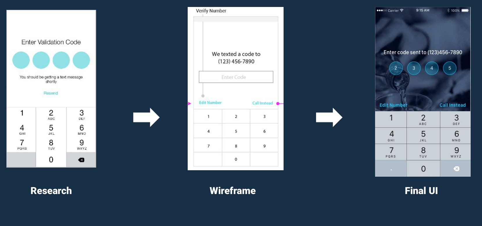
From an eight-screen account form to a phone number and a code.