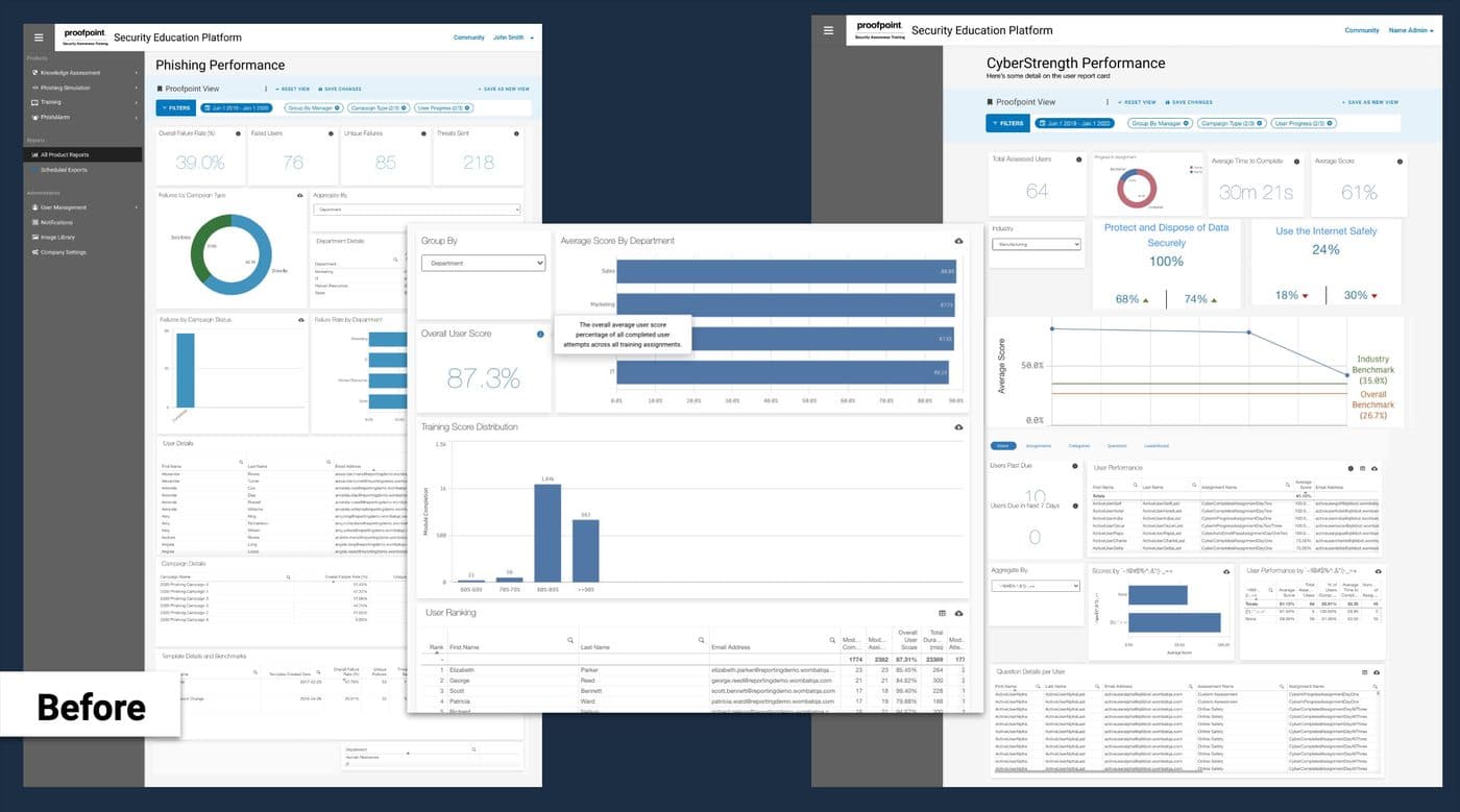
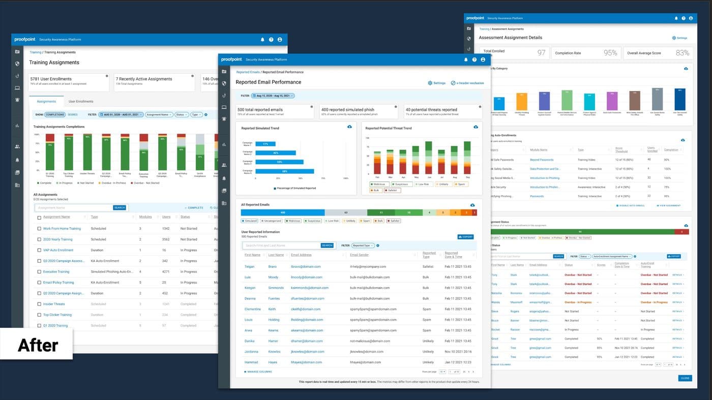
Replacing an entire reporting suite, without losing a customer.
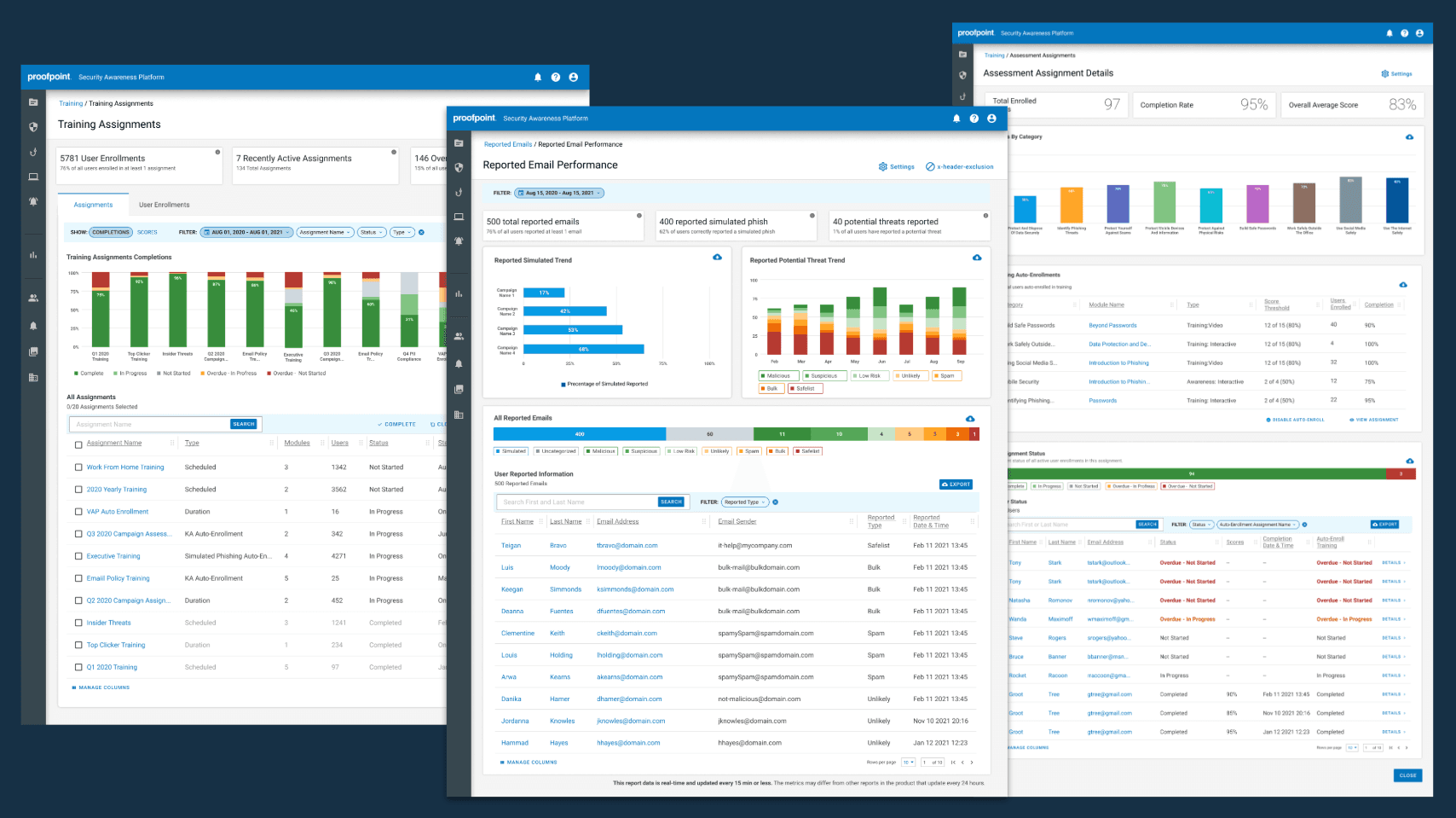
Reporting was the lowest-rated part of the security awareness platform, sitting at a −6 NPS and running on an expensive third-party data tool. As the design director, I put myself on the project as the lead designer. I ran the research, designed the reports, built the charting components, and replaced 11 batch reports with 4 real-time dashboards. Every satisfaction and usage target but one was met, and no customers were lost to the switch.
The problem
Reporting was the lowest-rated part of the product, and the data tool behind it was on its way out.
Customers told us for months that reporting was hard to use, disjointed from the rest of the experience, overly complicated, and not real-time. A reporting-specific NPS poll came back at −6. Meanwhile competitors were moving to real-time data, and the reports ran on an expensive third-party data tool the company wanted off the books before its renewal. That tool was not meeting our usability needs either.
So this was not a visual refresh. It was a data problem, a cost problem, and a trust problem at the same time, and it was the part of the product customers judged us on most.
The goal
The goal was fewer reports, real-time data, and no customers lost in the switch.
I set the primary goal as giving administrators real-time data in the place where that data was actually relevant, rather than in a separate reporting area. The secondary goal was getting off the third-party tool before renewal. I wrote the success criteria to be measurable and honest about risk:
New reports needed at least a 3.5 out of 5 CSAT.
New report usage needed to run at least 25 percent higher than the comparable old report within a quarter.
Old report usage needed to drop at least 25 percent.
Less than 1 percent of customer loss could be attributed to the change, because we were replacing the entire reporting suite while customers depended on it.
Discovery
I started from the research we already had, then ran cheap tests to pressure it.
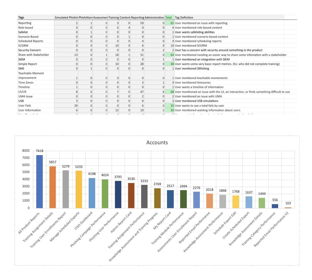
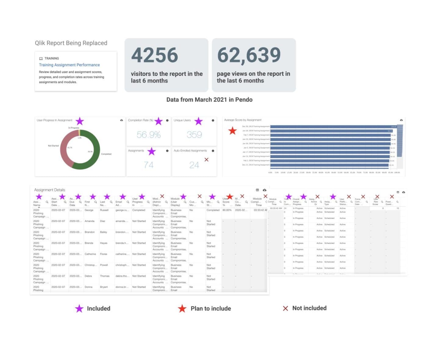
I had a repository of prior research and customer feedback on reporting. I tagged every comment by the problem it named, which gave me a ranked, counted list of the top concerns fast. I also had usage data for the reports we wanted to retire.
Rather than argue about what to cut, I tested it cheaply. The PM and I found one report with extremely low usage, hid it, and waited to see if anyone complained. Nobody did, which told us we were carrying a lot of data nobody used. I also took a real-time report proof of concept that a previous team had built and shelved, and put a beta link to it inside the product to get direction feedback before committing.
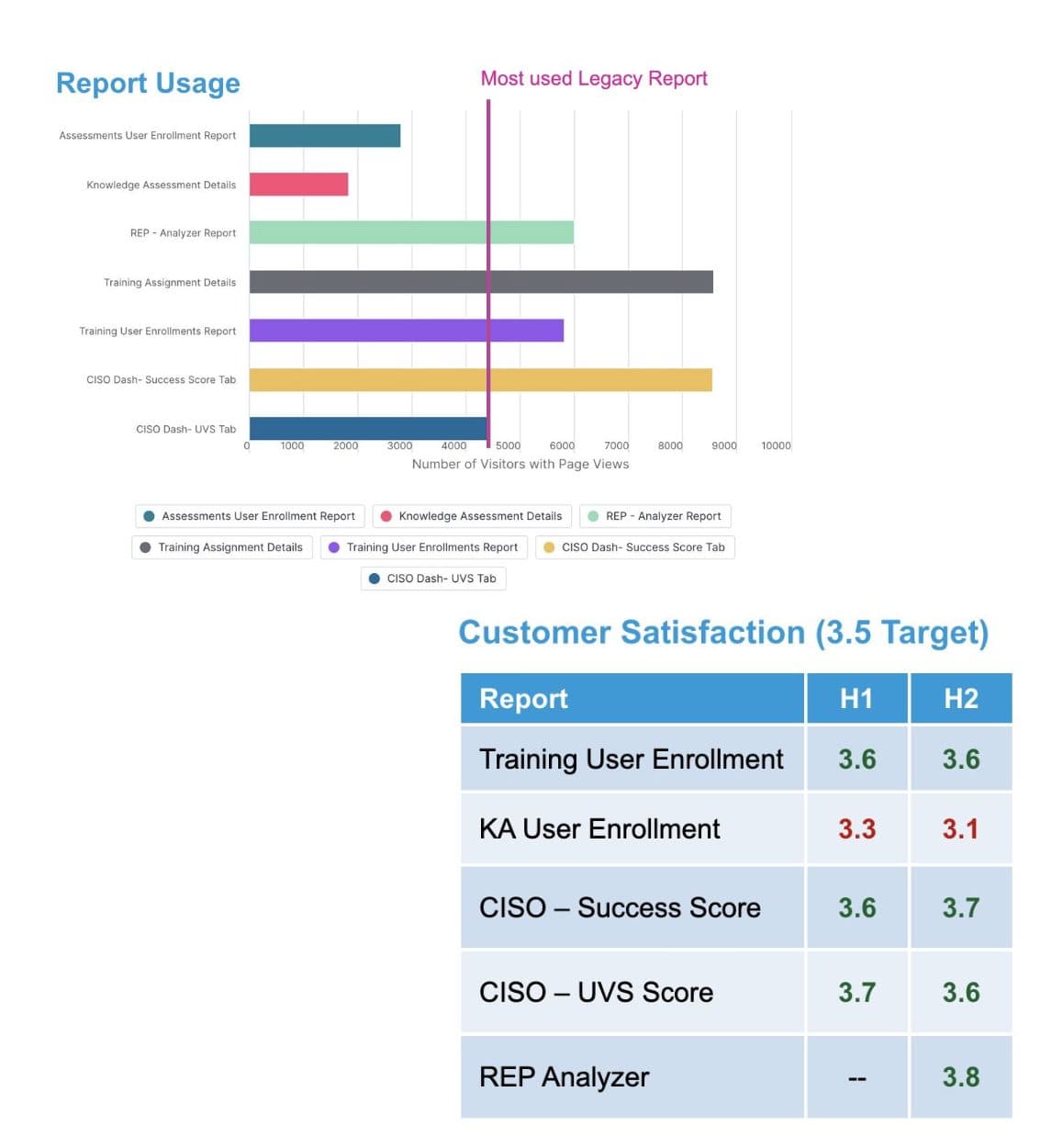
The one report that came in under the satisfaction target was a legacy feature that carried problems predating this work and was no longer being actively developed. That miss reflected a part of the product that was winding down more than it did the new reporting.
Research
The real question was which data actually mattered, and how people wanted to see it.
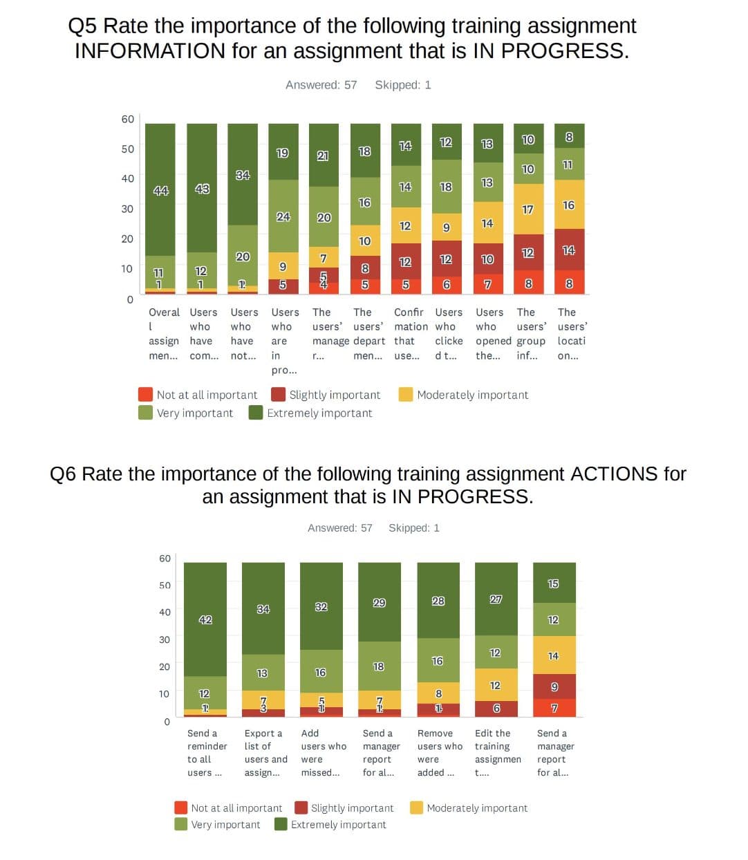
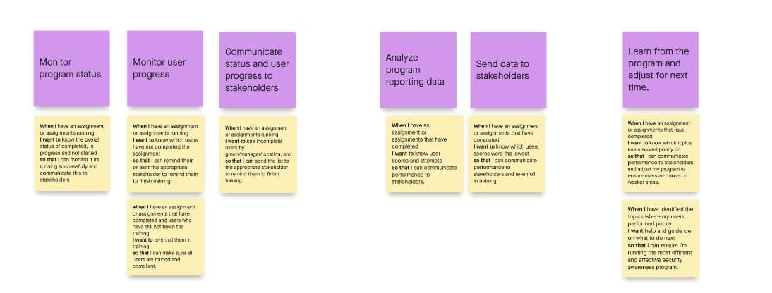
General feedback said "simplify," but that is not something you can design against. I ran surveys asking administrators to rate the importance of specific reporting issues and rank which kinds of data mattered most. That produced a ranked list of what we had to carry over from each report, plus job stories about what admins were actually trying to do.
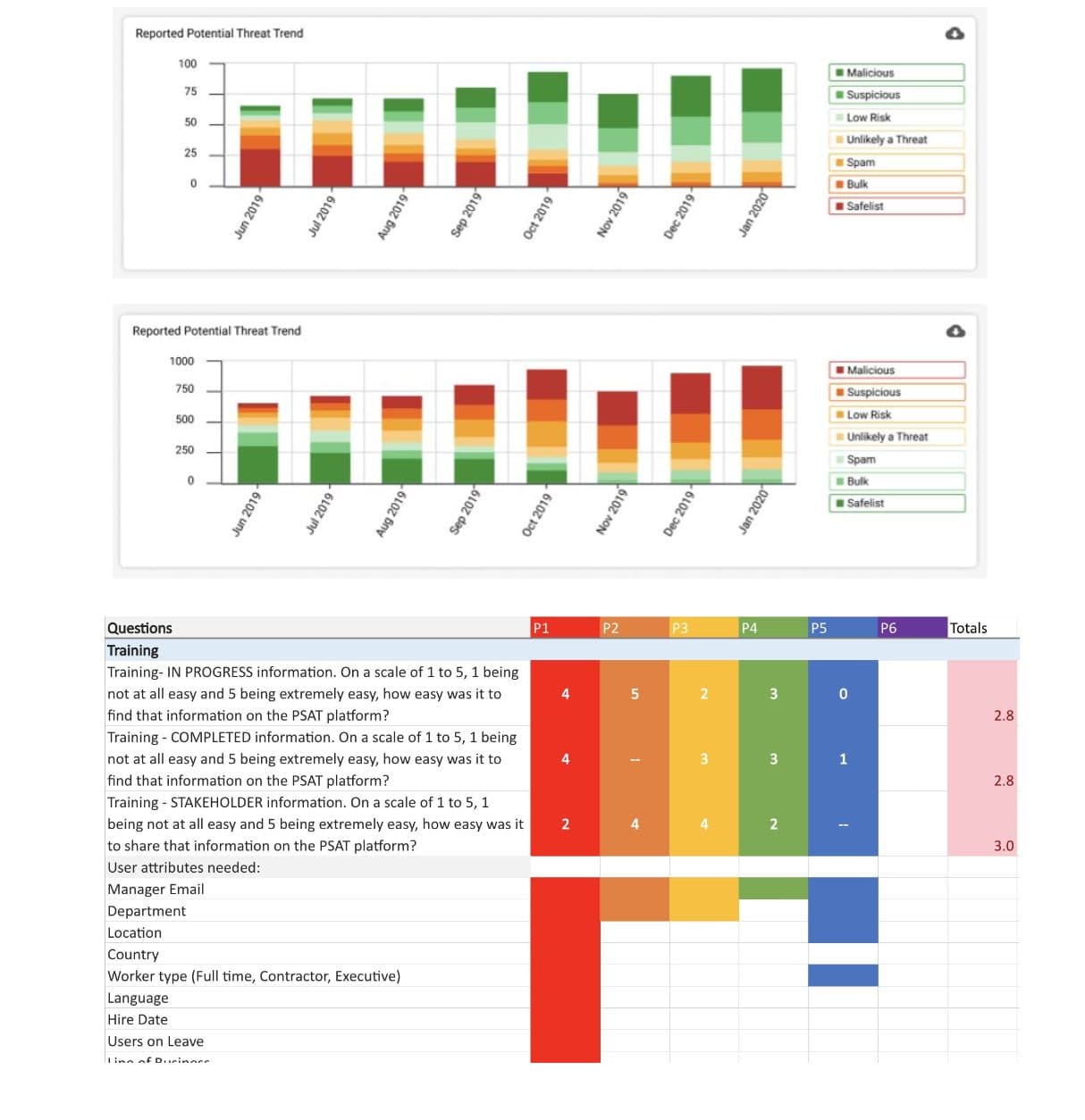
I reviewed secret-shopper competitor research to see what data we needed just to compete and what we had that could differentiate us. Then I built concept reports from the feedback, usage, and survey data, reviewed them in customer interviews, and ran user tests to check whether the data was the right data and whether the charts were clear and shareable. I built the charting components into our style system so reports stayed consistent and developers could reuse them.
Align and decide
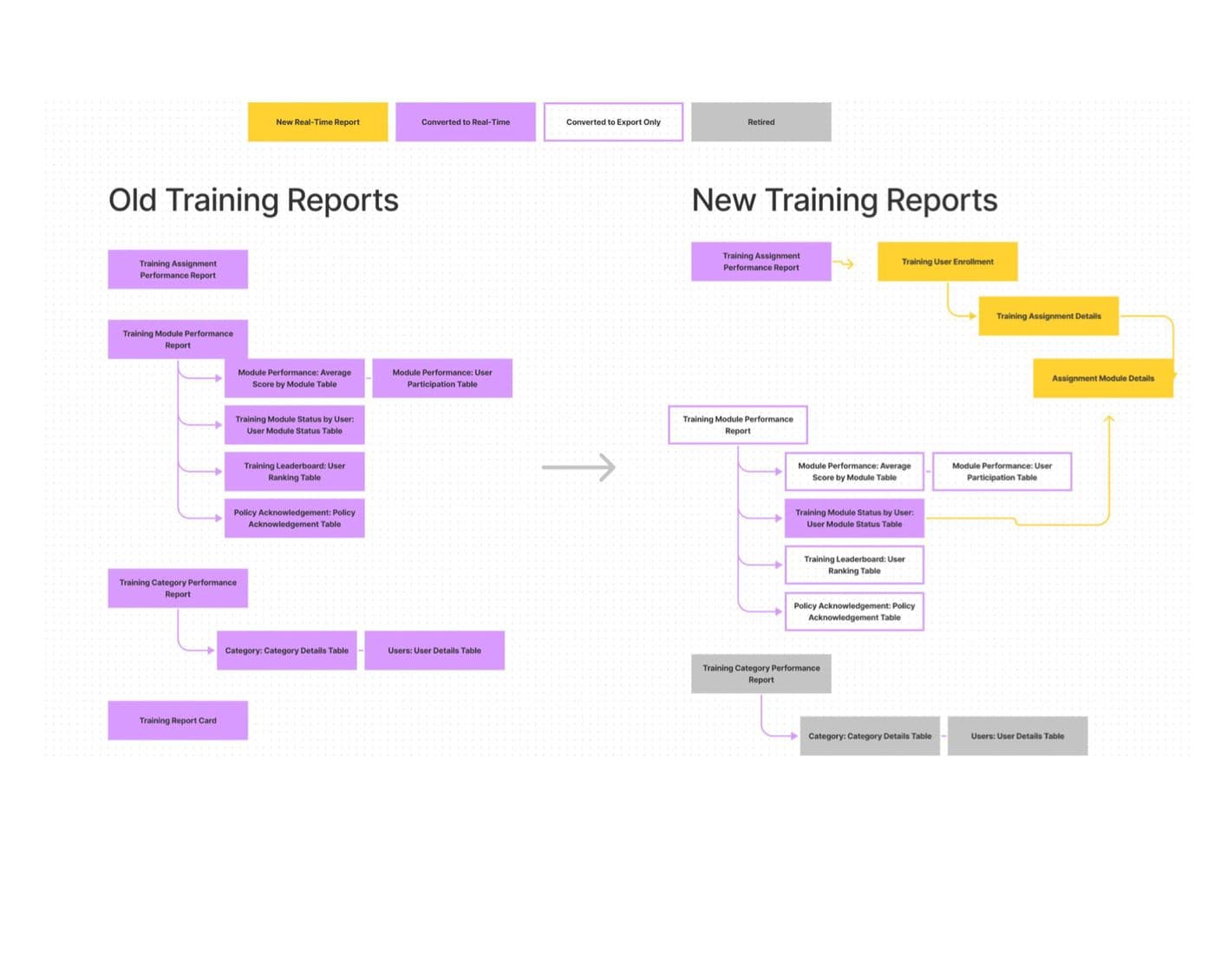
We committed to 4 real-time reports, with a clear rule for everything that could not go real-time.
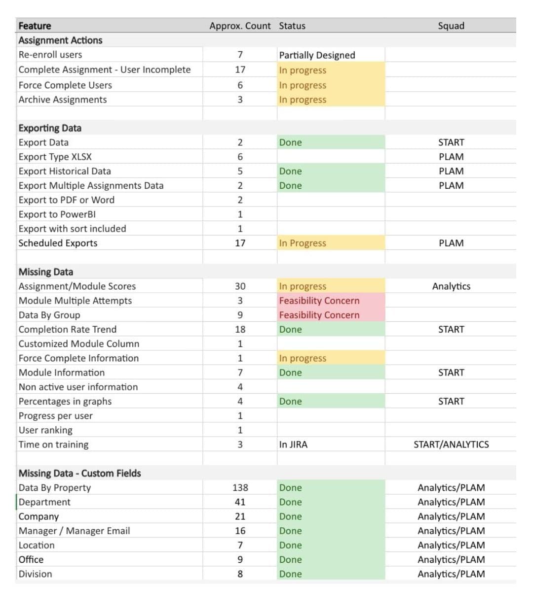
The team leads gathered the evidence and the available engineering resources, and we formed a hypothesis: we could go from 11 reports down to 4 or 5 real-time ones and still capture the majority of the data administrators needed. Anything else was acceptable to deliver within 24 hours by export only.
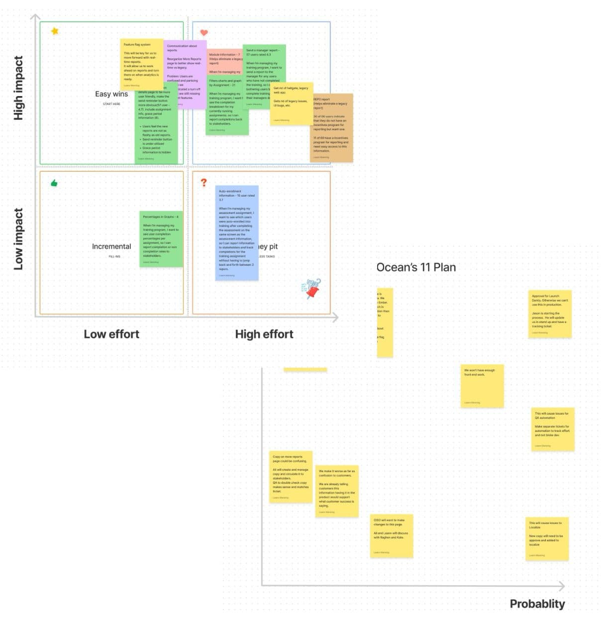
That rule mattered because pulling out the third-party tool could not be a one-to-one data match. The tool did calculations our own stack could not, at least not immediately. So we sorted data into what could go real-time now, what could follow after database refactoring, and what moved to a 24-hour export. I ran impact-versus-effort workshops to build the roadmap, then an impact-versus-probability risk pass to find the customer-satisfaction and technical risks and write mitigation plans for the worst of them.
Rollout
I replaced the suite one report at a time, watching usage and satisfaction at each step.
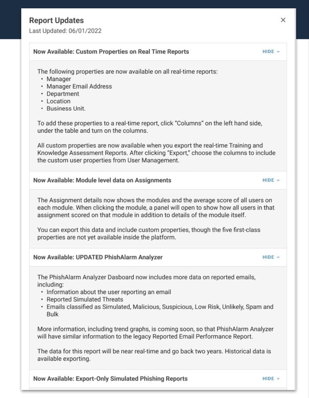
Given the deadline to turn off the old reports, we got deliberate about communication. We added in-product notifications telling customers which reports were changing and inviting feedback, and we briefed the internal customer-facing teams so they were ready for questions and could pull us into customer calls. That gave us two steady streams of feedback about what we might be missing.
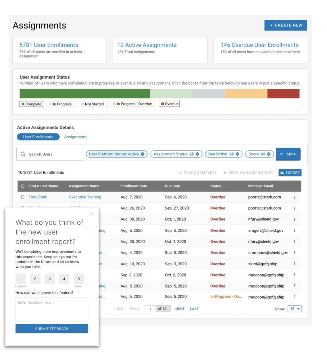
We took the first beta report to general availability, added satisfaction prompts on the page, then redirected the old report to the new one while leaving a banner link back to the original. The banner became another feedback channel and an early-warning system for anything critical. For the handful of customers who needed one or two data points we could not yet show live, we shipped export-only spreadsheets. Then we repeated the whole loop for the next three reports, tracking usage, satisfaction, and any churn at every step, and adding features where the numbers told us to.
What I would do differently
The miss was the customers who never logged in.
We learned that several high-value customers consumed reports through APIs and rarely logged into the product. Because of that, we missed a lot of their feedback and their API requirements, and we had to address those after the switch rather than before it. If I ran this again, I would map the API consumers as their own user group from the start.
The one report that missed its satisfaction and usage goals was also our least-used product area and one with a lot of standing customer concern, and I think those two facts are related. After the switch we went back and added new functionality and reporting to that area. Putting the new reports in front of users also surfaced features and data points worth chasing in follow-up releases, which is the good kind of problem.
Results
We hit every target but one, with no churn.
From a dense, batch-updated reporting area to real-time dashboards where people already worked.